Designed titles & lettering for Joe Berry’s two-volume debut album "Motions," to be released later this year.
title design
Designing titles for "George Ezra - Anyone For You"
I adore the feeling of handwriting on screen for a film’s title sequence. Whenever I’m asked to contribute mine for a music video, I slow my process down and start on paper. Listening to the song on headphones, I practice the shape of each letter, pouring a lot of consideration into how my design blends with the lyrics and the melody. I embraced this opportunity to collaborate with director Andrew Donoho again, after we’d worked together on “Find My Way” with Paul McCartney & Beck. It’s my hope that my lettering leaves behind a soulful impression on the visual accompaniment to each song I’m a part of, creating memorable experiences for the viewer.
Main title design for "George Ezra - Anyone For You," directed by Andrew Donoho.
End credit sequence from "George Ezra - Anyone For You," directed by Andrew Donoho.
Black marker on sheets of office paper. Also pictured, my headphones with the song on repeat.
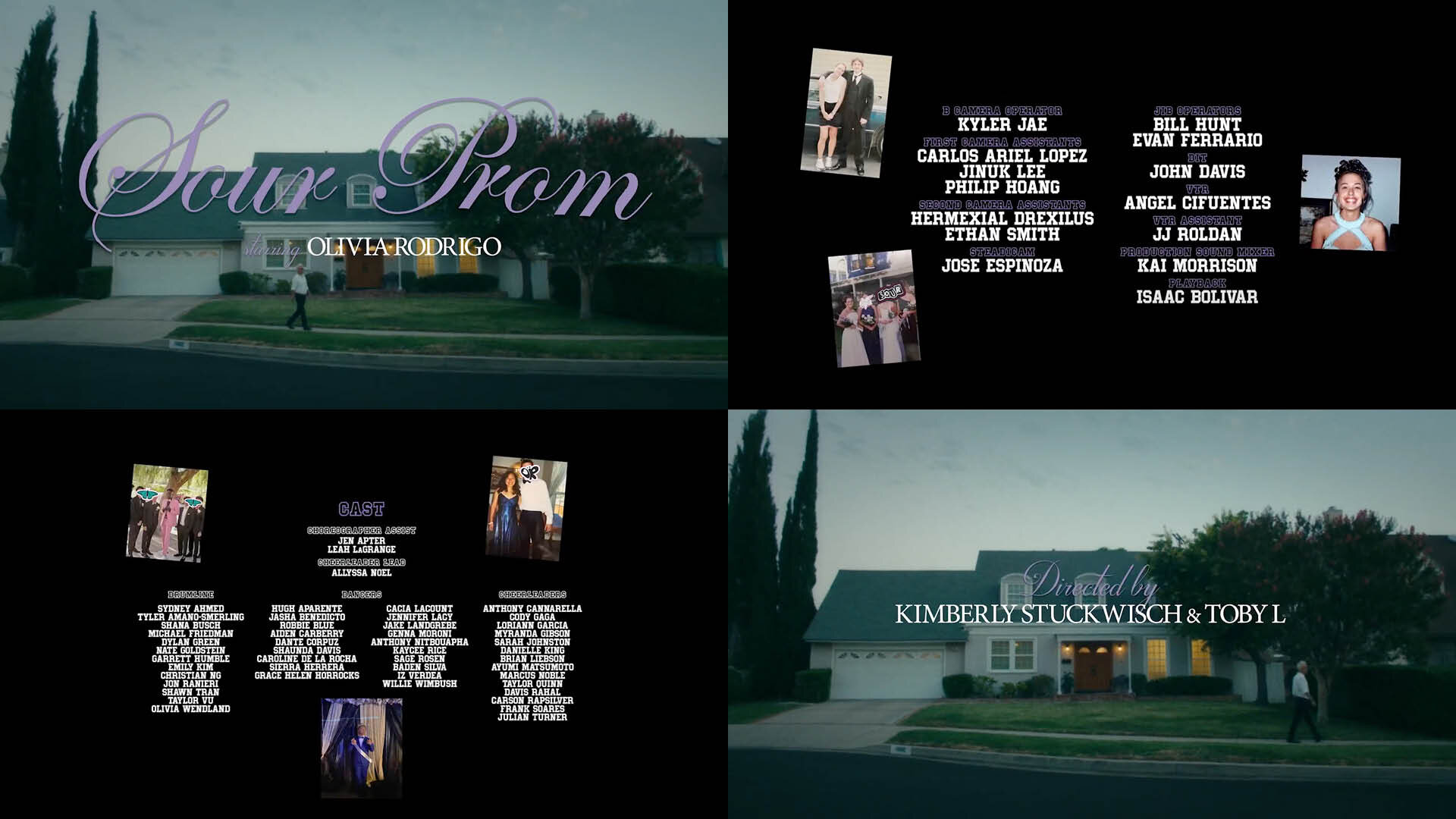
Title design for SOUR Prom; Dir. Kimberly Stuckwisch & Toby L
Title design for "Olivia Rodrigo - SOUR Prom"
I got invited to Olivia Rodrigo’s SOUR Prom this weekend by my dear friend and celebrated music video director Kimberly Stuckwisch. I was the title designer for the 28-minute concert film, framing the dizzying and dreamlike ball set to Rodrigo’s anthems of teenage heartbreak.
Title design for Sharon Van Etten & Angel Olsen
I contributed title designs for Sharon Van Etten & Angel Olsen’s collaborative anthem “Like I Used To,” given electric cinematic life by the ever inventive director, Kimberly Stuckwisch.
CREDITS
Directed & Production Designed by: Kimberly Stuckwisch (@stuckwisch) / Produced by: Ian Blair (@ian_swank_nsour_blizair) / Cinematography by: Justin Hamilton (justinphamilton) / Costume Design by: Phoenix Mellow (@phoenixmellow) / Edited by: Ellis Bahl (@ellisbahl) / VFX Supervisor: Ryan Ross (@ryromofo) / 1st Assistant Director: Hayden Rusk (@haydenrusk) / Production Manager: Jon-Michael Burgess / 1st Assistant Camera: Joshua Kirkwood / Gaffer: Julian Janigo (@360grip) / Key Grip: Darrin Stuckwisch (@beastieboyness) / Swing: Michelle O'Shea (@michelleelizabethoshea) / Makeup Artist: Rebecca Abram / Hair Artist: Mara Roszak (@mararoszak) / Construction by: Jack Massura (@jackmassura) / Color by: Kaitlyn Battistelli (@kaitlynbattistelli) / Title Design by: Sean David Christensen (@seandavidchristensen)
an Invisible Inc production (@inv.isibleinc) / Special Thanks to Zebulon, Lisa Hiatt, Jessi Williams, and Ryan Ross for donating locations and Elisa Randazzo of Cameo Clothing for donating clothing.
Title design for Moschino "Jungle Red"
Title design and animation for Jungle Red, a short film directed by Jeremy Scott for debuting the Moschino Fall/Winter 2021 Collection. I was brought aboard this project by my dear friend and filmmaker Kimberly Stuckwisch, who produced this cavalcade of high fashion and cheekiness with co-producers Geoff Yim, Ian Blair and Brooke Pace.
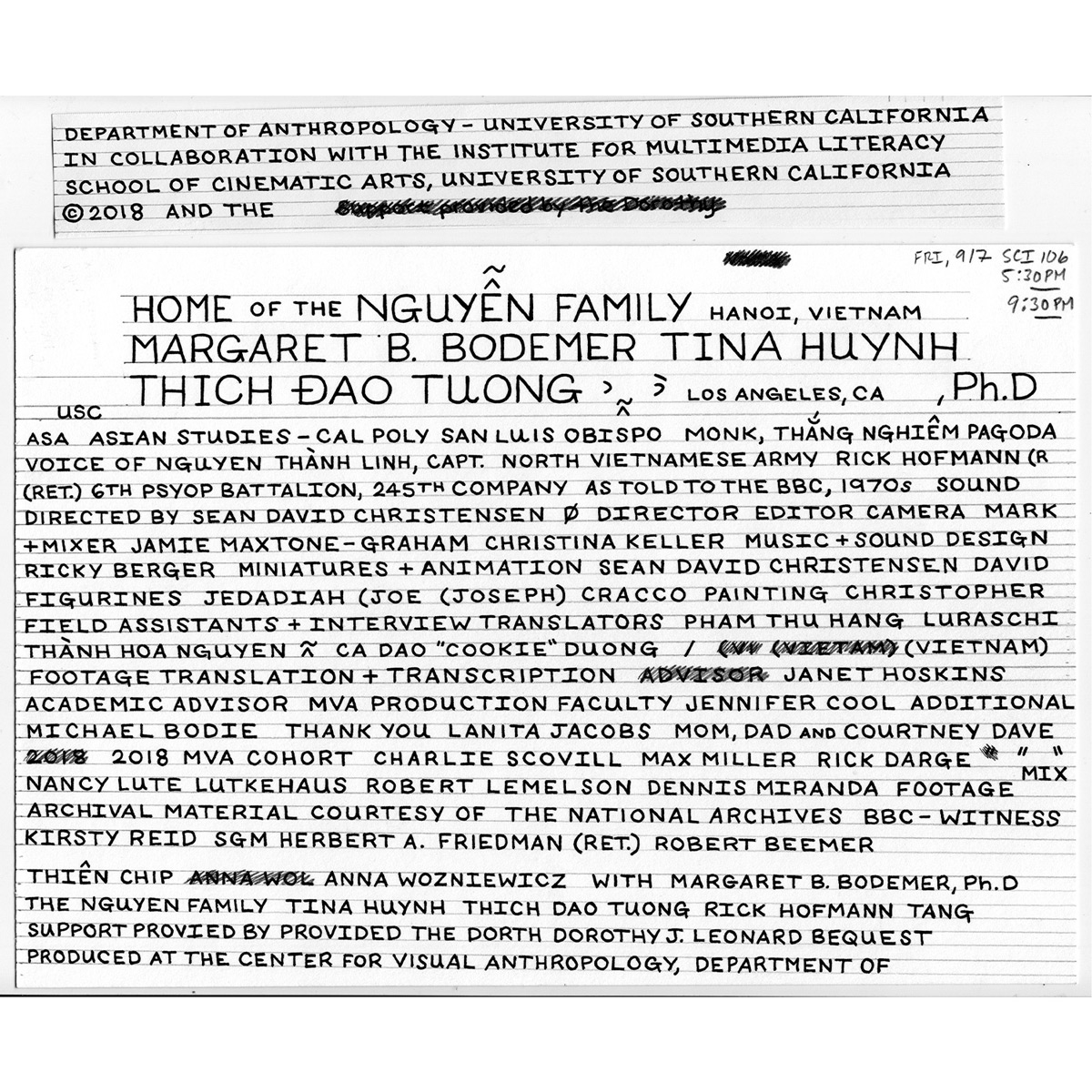
Unedited block of hand lettered text, to be converted into credits for my latest film.
Hand lettering cinematic titles & an appreciation for Pablo Ferro
One of my all-time favorite movie openings that elegantly incorporates hand lettered cinematic titles belongs to Jonathan Demme's Philadelphia. Masterfully pairing the film's theme (performed by Bruce Springsteen) with warm, cursive script, this sequence beautifully captures the shifting harmonies and subtle cruelties of an American city, one which claims brotherhood as its namesake (or brand), rather than an embodied ideal to strive for.
Even as a young child, I appreciated the feeling that came over me as I recognized titles on screen that weren't rigid and streamlined. Like in Philadelphia, these were deliberate, yet imperfect artistic choices. Handmade, preserving all their flaws. Their inclusion almost seemed like a clever trick, as if each card was an intruder, too sloppy for the big screen. Yet every time I'd come across this artist's work, whether I knew it or not, he evoked notes that I still can't describe. Going back through his resume, it's illuminating to realize his craft framed some of my favorite films as a child, my most formative to how I approach titles today: Dr. Strangelove, Harold and Maude, Men in Black & The Addams Family.
One of Pablo Ferro's most iconic works, his diabolically romantic opening titles for Stanley Kubrick's Dr. Strangelove, or: How I Learned to Stop Worrying and Love the Bomb.
I'm speaking of the great Pablo Ferro, whose unmistakable style is still as bold and fresh as it was right off the page in the mid-60s. As I've learned, in creating my own handmade titles for my upcoming film, this approach takes time and a great deal of patience, much like re-fueling a B-52 in midair. Starting with a ruler, paper and some technical pens, I've reconnected with that childlike fascination of the bond between the hand and the page, an artistic choice that is imprinted with as much care as setting up a shot or smoothing out a piece of audio. Every bit counts.


